Launch Week I Day 1: New Way to Explore and Add Pieces
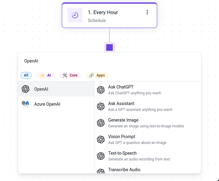
Today, we’re excited to introduce a new enhancement to our automation flow builder—a more streamlined, simplified design that makes it easier for you to add or replace steps in your flow.
Background
When I first came across business automation, I knew I wanted to work on a tool that further enhances the concept from what the market had already provided, so I joined Activepieces as its first employee in 2022 and ever since then I didn't look back. When we initially designed Activepieces, we didn't have much knowledge about how the user journey through making their automations should look like. The initial user journey began with click on the "Add" button, which would then reveal a right-side panel for pieces. We introduced categories and a basic search function to help users find what they needed. Over time, we enhanced the search functionality for better usability and added suggestions for actions/triggers. Throughout this process, our primary focus was on improving the searching functionality rather than on optimizing the overall user experience and navigation.
Since adding/replacing steps is an essential part of flow builders, we decided to redesign the experience while focusing on improving both productivity and exploration.
Design Details
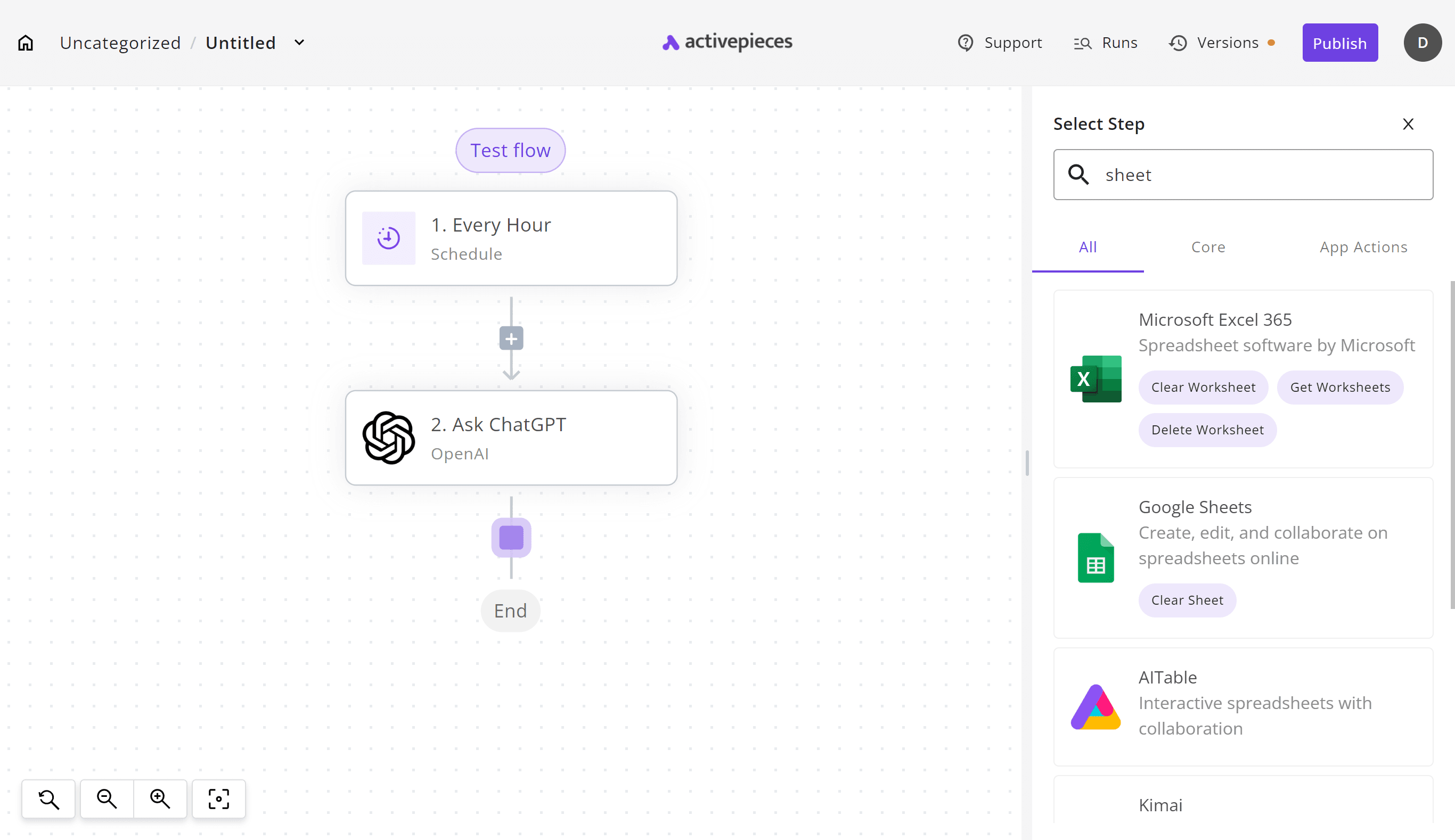
In the previous version of our user interface, adding a new step to your flow could feel both distracting and time-consuming. The process required you to click near the center of the screen, only to shift your focus to the right side to search for the piece you needed. This created unnecessary interruptions and broke your concentration. If you were just exploring the pieces, you had to select one, explore its options, and if it wasn’t what you were looking for, delete it and start over.
Here is a small comparison of how it looks.
Productivity:
Here’s how things looked previously when you clicked the add button:
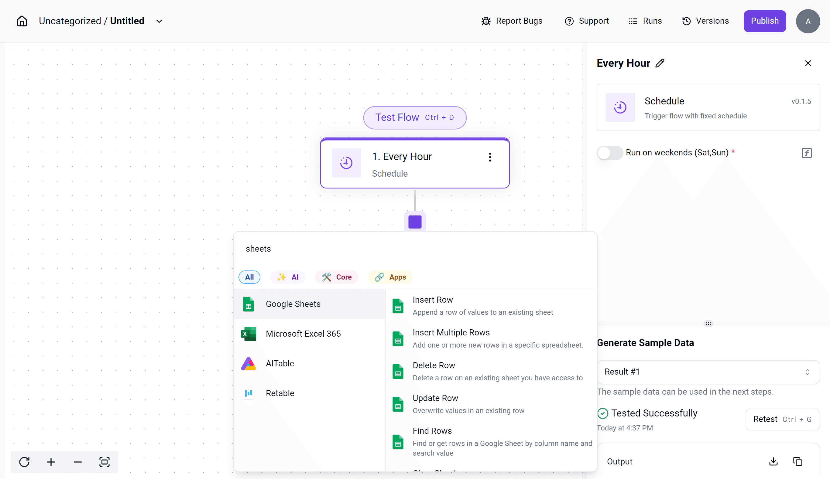
And here’s how they look now:
Exploring Your Options:
We noticed how it is a tedious experience to have to add a step to your flow, then check if it had the action/trigger you want was there, so we decided to improve on this:
Before
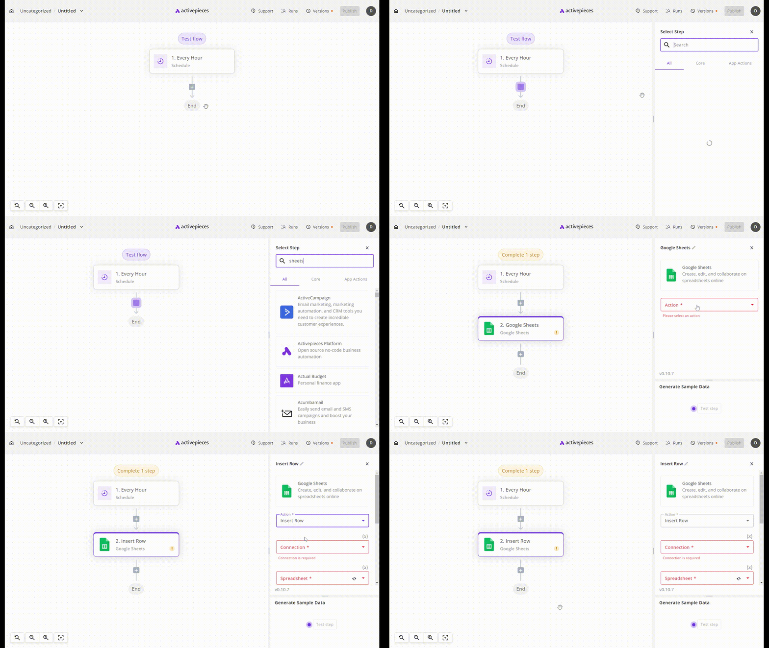
So we decided to make it easier for users by allowing them to see what trigger/actions the piece you select has, before adding it to the flow:
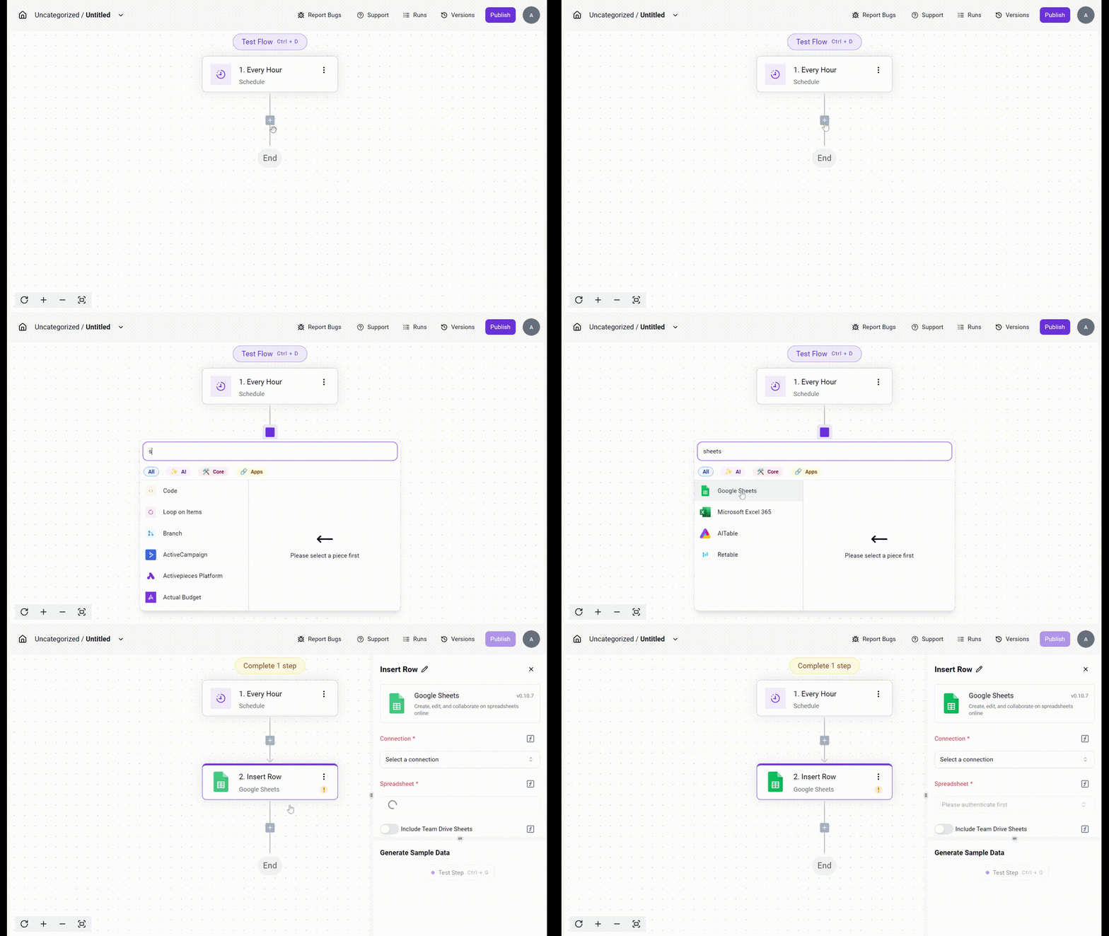
We also added an "AI" category so you can see all of our AI pieces in one place:
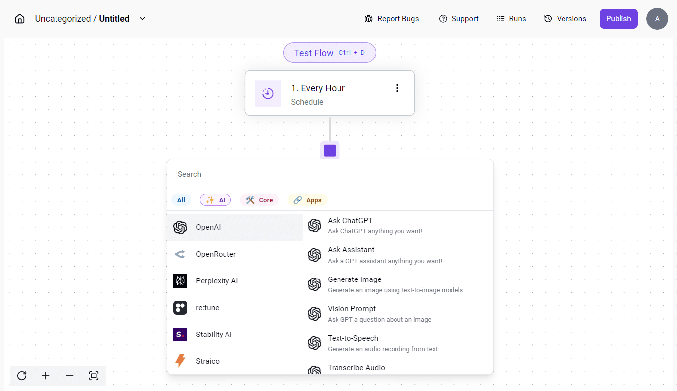
Replacing Steps:
As we mentioned earlier, our old user interface didn’t allow you to quickly replace a step. While it did allow users to change the action from within the piece settings, many people did this out of curiosity and ended up losing all the properties they had already filled in. This made the design less intuitive, If they wanted to change the piece type they had to delete the step and add another one again.
Before
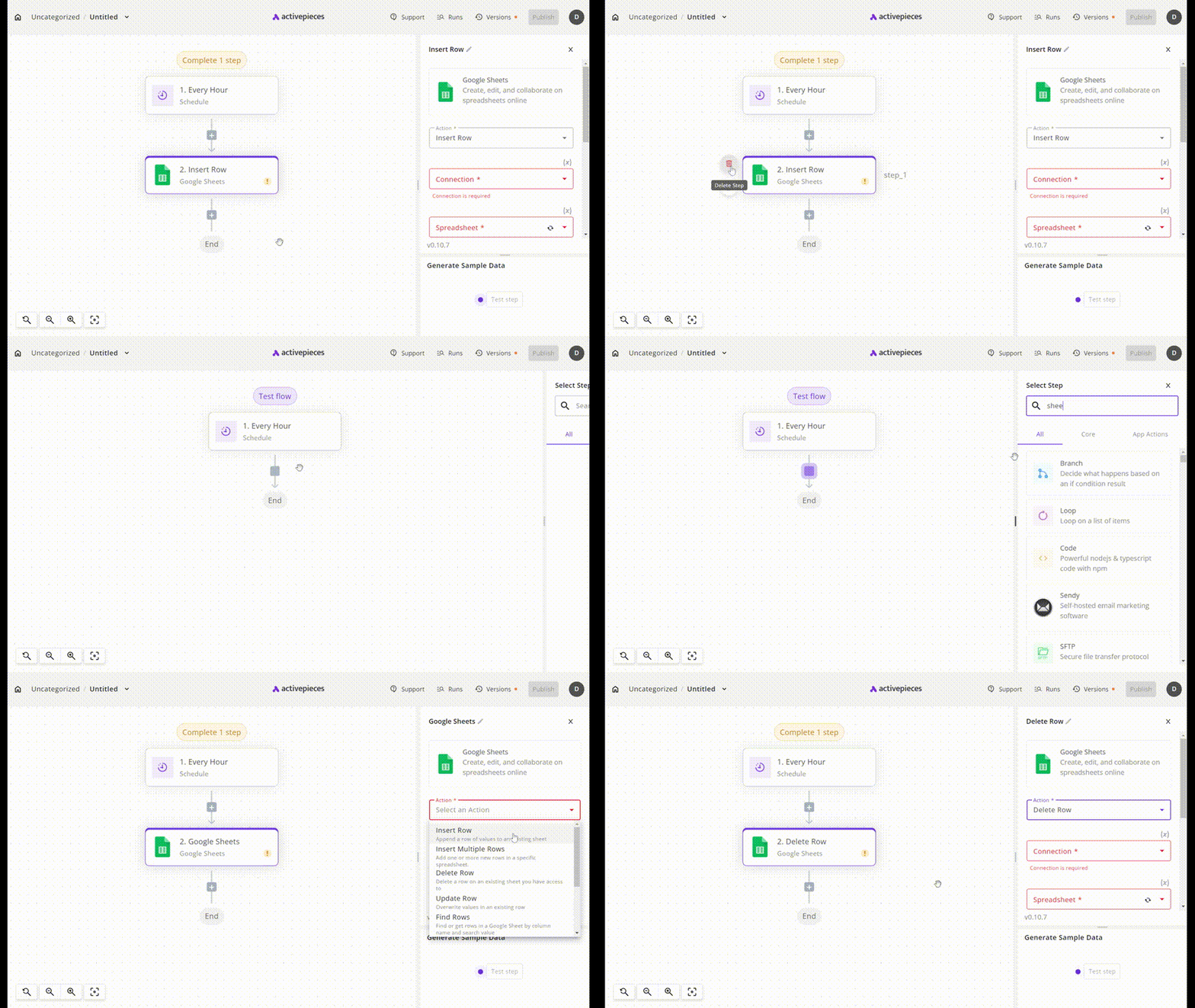
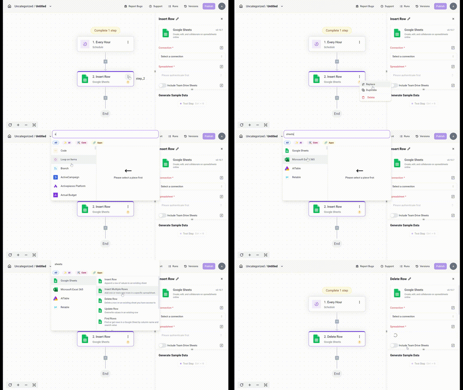
Now, with our updated design, simply click the three dots on the step, select "Replace," and seamlessly continue your work without interruption.
After
This is just the beginning. We’ll keep refining and enhancing this feature to make it even easier, more efficient, and user-friendly. We're excited for you to try it and can’t wait to hear your feedback!