Launch Week | Day 5: Dark Theme, Table Filters, and Keyboard Shortcuts

Today, we’re excited to introduce a much-anticipated feature: the dark theme, along with a new design and keyboard shortcuts.
It's surprising how many people request the dark theme these days. When we first started, we launched with a light theme. But it didn’t take long before users began submitting tickets on GitHub asking for dark mode, or using browser extensions to convert our site to dark mode.
We recently transitioned from Angular Material to ShadCN UI, making our website look smoother, cleaner, and simpler. It took about five weeks to rewrite the entire interface from Angular to React—a remarkable achievement, made possible by our outstanding team of developers.
In the process, we removed around 140,000 lines of code and added 70,000 new ones.
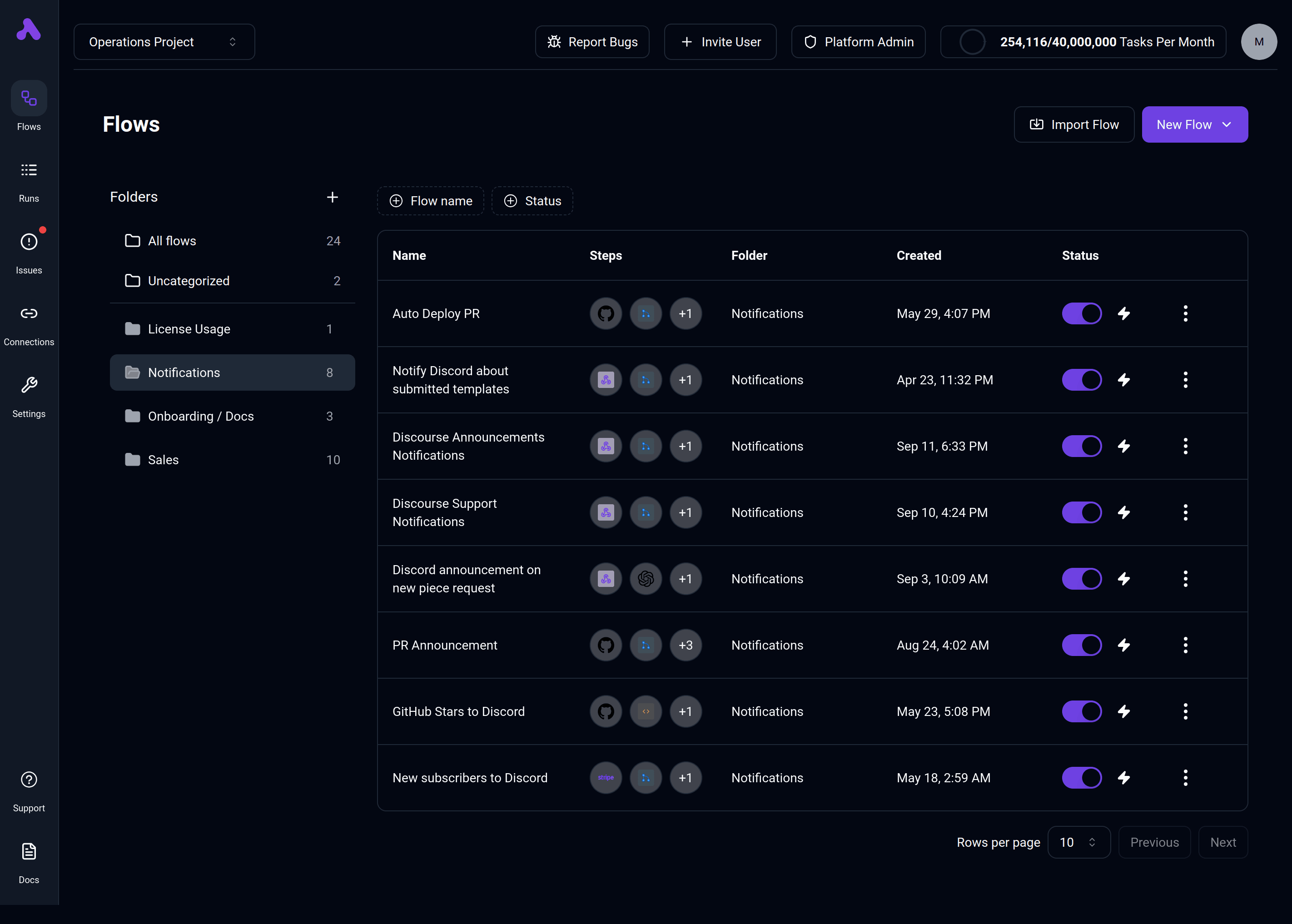
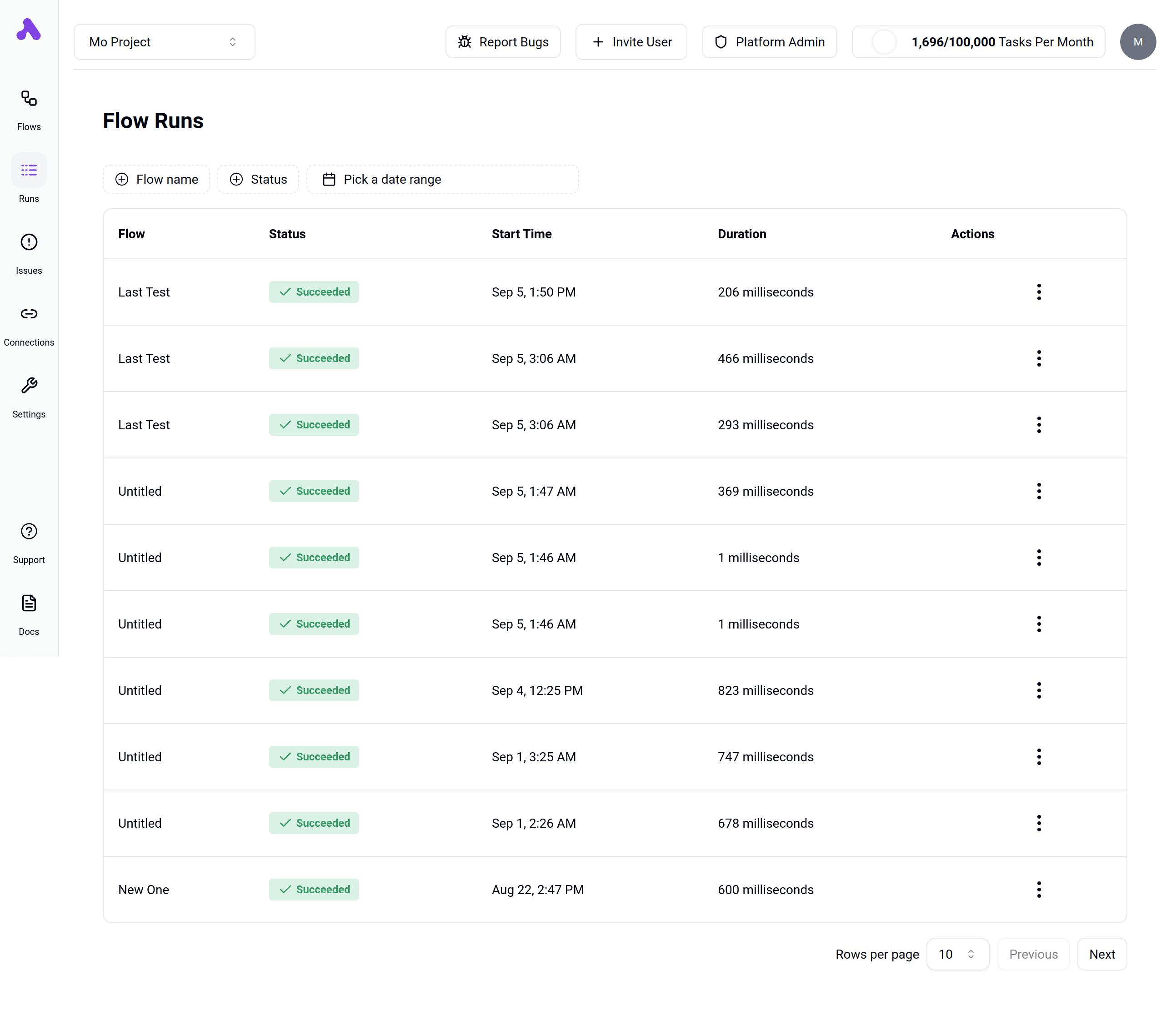
New Tables & Filters:
We’ve added new filters to all tables, connections, flows, and flow runs.

Dark Theme
The much-requested dark theme is finally here!

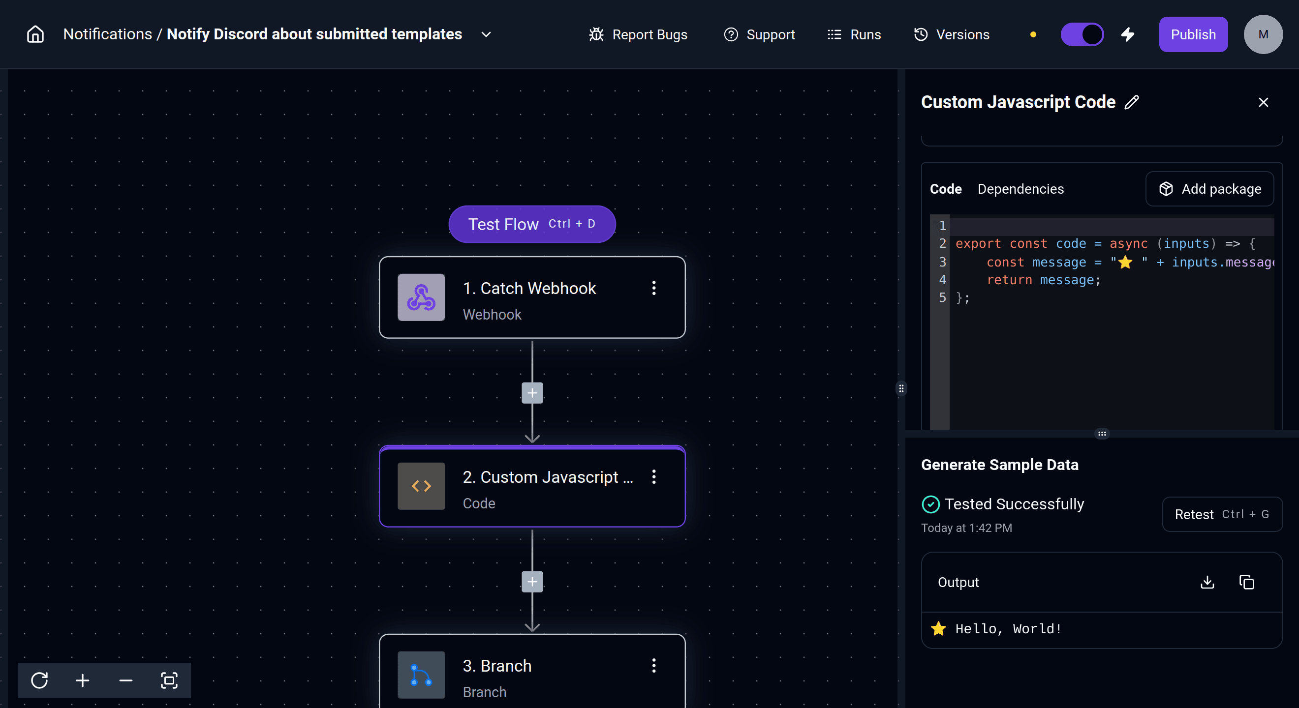
Keyboard Shortcuts
We know productivity in the builder is a key metric, so we’ve started improving build times by releasing new piece selectors (https://www.activepieces.com/blog/piece-selector) and introducing keyboard shortcuts for frequently used areas.
- Testing Step: Especially useful when writing code, allowing you to quickly press a shortcut to get results.
- Testing Flow:
- Exiting Run
We don’t plan to overwhelm users with shortcuts but aim to keep the number small, ensuring they are easy to remember and improve productivity.

We’d love to hear your thoughts—join the conversation at community.activepieces.com and let us know how SubFlow has streamlined your workflow!